Sparebanken Norge
A new bank, two hundred years in the making
In August 2024, Sparebanken Vest and Sparebanken Sør agreed to merge into the country's largest savings bank and its third-largest bank, with close to 800,000 customers, 67 local offices and a clear ambition of taking a hyperlocal banking model national. Bank mergers tend to fail their brands in one of two ways. Either the new identity erases history and turns generic, or caution wins and the expression loses force. The task: a brand to unite two organisations and mark a new chapter without erasing the histories it was built on.
Through a symbol drawing two mirrored forms into an N for Norge (Norway), a warm red claimed in a blue and green category, and a custom typeface cut from the symbol's curves, Kurppa Hosk built an identity around a single idea: the meeting point, where two banks, two landscapes and two perspectives form a new constellation. Close to a thousand variants were drawn before the form was set. It carries fjord and mountain in its curves, and holds past and future in a single figure.
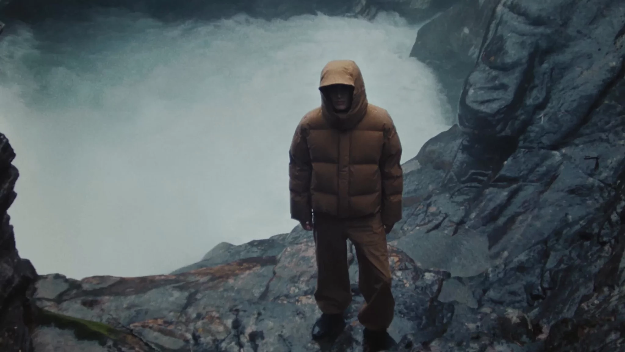
Built as a system for motion, scale and variation, the identity pairs a bold graphic expression with photography of real, everyday moments. It holds from the mobile bank to office facades to the thousands of sports kits the bank puts its name on. Presented first to employees, many of whom had sketched proposals of their own, it became a unifying symbol through a demanding internal transition.
On 2 May 2025, Sparebanken Norge launched as one bank with one identity. Since then, the brand has done what it was built to do: travel. Within its first year, the bank merged with Oslofjord Sparebank and opened offices in Oslo, Tromsø and Molde, with Trondheim underway. Norway's largest savings bank enters its biggest cities with an expression that is warm, clear and unmistakably its own.


Campaign photography: Lasse Fløde. Case photography: Magnus Nordstrand. Copywriting: MOS. Code: Stök.
Explore more brands